Part I: Updating Your Logo
On the internet image is everything: The web is a truly visual experience. The appearance and usability of your company’s website shapes a visitor’s perception as to the quality and reliability of your business as a whole. One could argue that having no website would be less harmful to your company’s reputation than an out-of-date and or broken/limited functionality website. The flipside, of course, is to present your visitors with pages that are visually appealing, easy-to-use to make a strong positive impression. This is an important element of building a lasting business relationship and ultimately greater success for you.
A good logo is a key element of your business’ presence. It conveys information about your business on an almost subconscious level. If you logo looks old, unbalanced, and thrown together those negative concepts will invariably carry over to the perception of your services and abilities. A strong logo exudes confidence and says you care about your appearance.
Many customers have logos that worked fine in the last century during the paper age. Now in the digital era, it is possible to communicate more information more effectively with your logo via limitless colors, exciting effects and even animation.
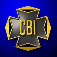
 CBI’s original logo served them well. The company is proud of its 40-year heritage, but the logo looks its age. As part of integrating the web to expand their footprint, CBI asked TCS to modernize their logo.
 We start by tracing the shape and extruding into a 3-Dimensional object. A treatment is also done on the text to make it more readable and balanced.
 Through the use of lighting, textures and post processing effects we now have an updated logo! The original brand identity has been preserved, yet the look and feel is updated.


